How we use colour in a care home
Colour in a care home affects residents more than we think. It has a direct impact on how we view our environment, which then influences our emotions and wellbeing. And this is especially true for older adults, as colour can help our residents better move around the home, and better distinguish the objects around them.
In the design of Birchwood House, we’ve made sure colour has not been an afterthought, and we use our thoughtful colour choices to make our home as welcoming as possible:
Colour on the inside
For all bedrooms and communal spaces, we use colours to create a calming, peaceful atmosphere.
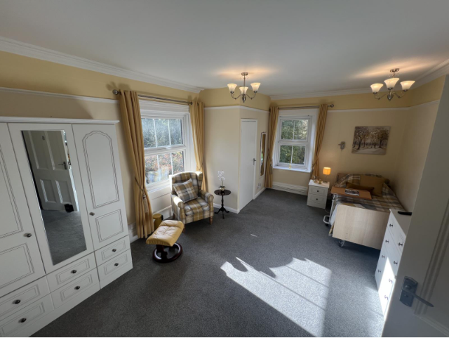
Yellow is a popular colour for our bedrooms, being linked to happiness, and optimism. It’s also been linked to appetite, as yellow can trigger a part of the brain (the hypothalamus) that regulates hunger. Soft, golden shades can create a cozy atmosphere, and it’s even been linked to energy and creativity, helping stimulate our residents for their activities.
This a similar theme with our walkways and communal spaces:
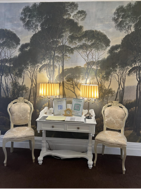
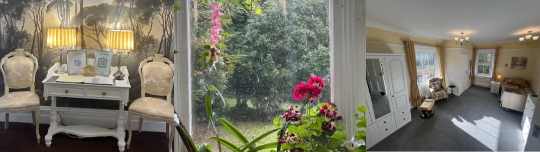
We use wallpaper with soft, natural shades of colour to go with the warmth of the yellow lampshades. Our furniture is mostly cream and beige tones to keep the space open and airy, but with a darker carpet so the seating area is easily recognisable, especially for those with limited vision. We keep all of our designs in a familiar, traditional style, as we’ve found it can be nostalgic to older adults, and better remind them of the decor they grew up seeing.
Colour on the outside
It’s not just inside the home we think about, but also the outside world. At Birchwood, we’re so lucky to be surrounded by the beautiful Kent countryside, with nine acres of landscaped gardens. This means that our Victorian conservatory is always complete with flower canopies and grapevines, giving all our communal rooms a stunning view that’s filled with bright colour.
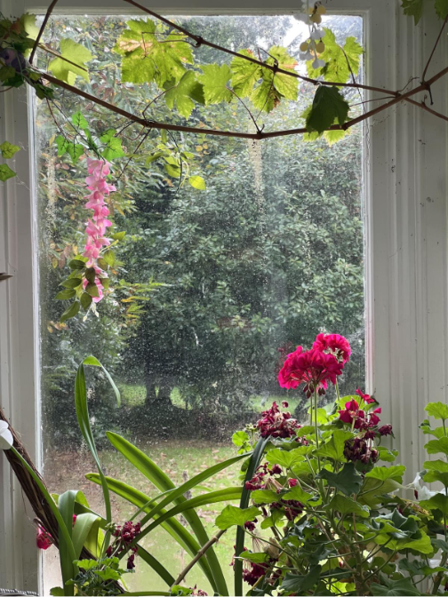
Our garden allows our residents to feel better connected with nature, with bright colours and natural light helping regulate mood. Watching the seasons change from the conservatory can be especially helpful in creating continuity for our residents, helping them with a sense of time and reducing any confusion.
Colour for additional needs
For those with dementia and other complex conditions, there can be difficulties with vision, hearing and depth perception, all of which can lead people to misinterpret their surroundings. Rooms can appear disorientating and confusing, and losing that sense of place can make these conditions feel all the more isolating. We use bright and contrasting colours to help with this, so objects can be more easily distinguished and residents can know where they’re going around the home.
This is similar with our uniform, and we use bright, neutral colours to help residents identify our team easier. When looking for help, it’s important for residents to know what we wear, so they can see there’s always a friendly face nearby.
Colour is also essential to our Birchwood logo, and we chose green because it’s linked to calmness, nature and health. We’re not here to look like a clinic or an institution, but to remind families and residents they’re in a peaceful and nurturing environment, where their wellbeing is always the top priority.
Our world has never been in black and white, and for good reason! Colour is essential for comfort and familiarity, helping us to better connect with our surroundings. And in a care home setting, it’s not just a decoration choice, but a way of boosting mood and providing reassurance for our residents.
At Birchwood House, our mission has always been to enrich life in a beautiful setting, and that goes into each and every colour choice. To find out more, please get in touch.